How to Choose Wall Art for Your Bedroom? 5 Styling Tips to Create a Soothing Private Retreat
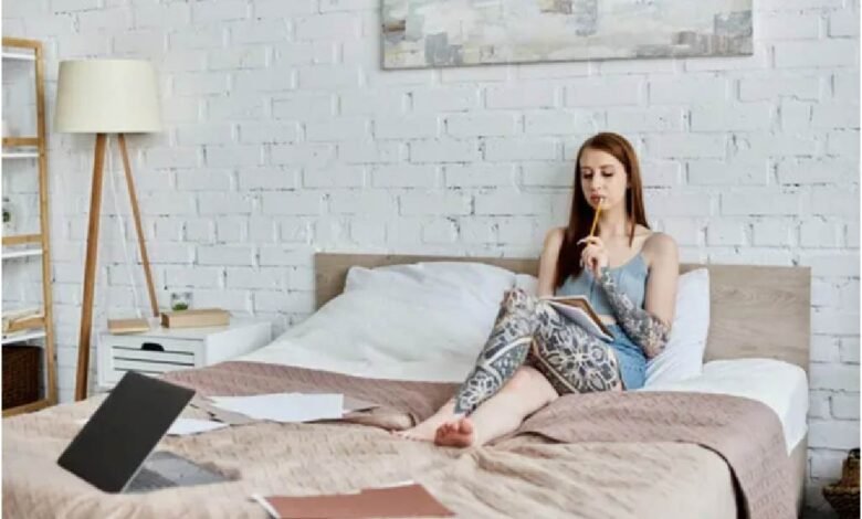
As the private space where we spend the most time each day, the bedroom is a place to soothe both body and mind—a small, intimate sanctuary all to ourselves.
To be honest, I never realized how important wall art was… until I stumbled into a whole bunch of pitfalls.
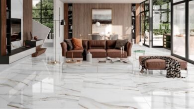
My bedroom used to look like it was “just one step away from being fully decorated.” The bed was comfortable and stylish, the bedding colors were coordinated, and the lighting was soft and warm, yet the overall atmosphere lacked warmth—something just felt out of place.
Later, I realized the problem lay in the blank walls.
I still remember the first piece of art I bought: it looked exquisite and timeless online, but when it arrived, it was hard to describe—the size was ridiculously small, awkward and out of place. Even if I managed to hang it on the wall, stepping back to take a look, I was left with only one question: why does it look so cheap?
It was at that very moment that I had an epiphany: when choosing bedroom art, you can’t just look at the aesthetics; compatibility is the key.
After countless trial-and-error experiences (and, of course, a few regrettable purchases), I’ve distilled a few simple yet effective styling rules. If you’re also struggling with bare, monotonous walls or a cluttered, mismatched decor scheme, these 5 practical tips will save you time and money while helping you avoid decorating headaches.
Determine the Size First: If the proportions are off, even the most beautiful piece is useless (A Must-Read for Beginners)
Once you choose the wrong size, even the most beautiful decor won’t save the day.
I used to guess sizes based solely on product photos and my gut feeling—a mistake that proved to be a huge blunder.
Here’s a practical and easy-to-remember golden rule: The area of a decorative painting should cover 65% to 70% of the wall space it occupies.
However, don’t treat this standard as a strict rule.
I’ve found that slightly smaller sizes—say, 50% to 55%—actually create a cleaner, more streamlined look, which works especially well with minimalist decor.
From my personal experience, hanging a long, horizontal piece above the headboard instantly makes the bedroom feel more spacious. For homes with high ceilings, opt for vertical artwork to visually raise the ceiling height—I’ve tested this, and the results are stunning. If you have a large blank wall, choose a multi-panel artwork set; it’s the most hassle-free and foolproof option.
Oh, and here’s a handy tip: Before placing an order, I cut out a piece of newspaper in the desired size and tape it to the wall for a preview. It might look a bit silly, but it perfectly helps me avoid making another costly mistake!
Matching the Style: Artwork Should Be an “Extension” of the Style, Not a “Jarring Accent”
I only truly understood this after falling into a major pitfall myself.
My bedroom has a soft, minimalist style, with light gray and off-white as the main colors—it’s elegant and understated overall. But once, on a whim, I bought a painting with intense colors just because it looked stunning in the online photo. However, once I hung it up, the entire atmosphere felt instantly off. That painting seemed completely out of place in my room. Later, I replaced it with a soft-toned abstract piece, and the whole space instantly felt harmonious again—my bedroom regained its peaceful, comfortable vibe.
My Practical Styling Guide:
Minimalist and Scandinavian styles pair well with soft abstract art, line art, and muted neutral color palettes
Vintage and French styles pair well with textured oil paintings and warm color palettes.
Natural and Japanese styles pair well with botanical illustrations, landscape prints, and muted green tones.
Having learned from my past mistakes and wasted money, I now constantly remind myself: when it comes to bedroom decor, avoid anything too eye-catching or flashy.
If the visual impact is too strong, it will completely undermine the relaxation and healing atmosphere a bedroom should have.
Color Coordination: Follow the “Same Color Family + Low Saturation” Rule to Double the Soothing Effect
At first, I hadn’t given color coordination a second thought, but reality taught me a valuable lesson—the transformation it brought was beyond my wildest imagination.
Bright, high-saturation colors might look stunning in a living room, but when used in a bedroom, they can actually make you feel restless over time.
For bedrooms, a more suitable approach is: same color family + low saturation
My bedroom is primarily gray and off-white, so I chose decorative art in the same color family, adding just a subtle touch of other colors.
For example, there’s a piece I really love from Huemaster. It features soft gray tones with hints of light blue, perfectly complementing my throw pillows. The overall look feels natural and effortless, without any of the stiffness that comes from forced design.
Based on my own trial-and-error experience, here are the color combinations you should avoid:
- Bright reds and neon colors, because while they may seem fresh at first, they’ll eventually become visually exhausting
- Single pieces with overly complex color schemes
- Groups of art with chaotic tones that clash with one another
Conversely, if your room has a predominantly dark color scheme—such as dark green or charcoal gray—light-colored decorative art can effectively balance the overall atmosphere and brighten up the space.
Incorporate Personal Items: Add Warmth to Decorative Art and Maximize the Sense of a Private Home
I think this is probably the most easily overlooked tip.
Even if a room is exquisitely decorated, it can still feel empty and impersonal.
I’ve found that when I pair my main artwork with personal touches like travel photos or niche illustrations, the space truly feels like my own.
I have a friend who frames her own travel photos. While the photos aren’t professional or polished, seeing them every day brings her joy.
Ultimately, this sense of comfort and healing is far more important than trendy, viral art prints.
You can choose to incorporate postcards or personal photos, select artwork that aligns with your interests, or pair your wall art with small, soft home decor accents. All of these can infuse your space with your own unique touch.
This is also why I occasionally enjoy browsing Huemaster: it offers many niche and unique design styles that aren’t cookie-cutter, making it easier to find decorative pieces that match your personal style and radiate warmth.
Pay Attention to Lighting: Details Determine Texture; a Sense of Comfort Lies in Light and Shadow
I used to think lighting wasn’t important—until I hung a painting in a dark corner.
It looked fine during the day, but at night it appeared blurry and dim, lacking any aesthetic appeal and feeling dull and oppressive.
After moving it to a spot with adequate light, the painting’s texture was completely transformed—it was like getting a whole new piece.
Here are a few practical tips:
- Avoid direct sunlight (prolonged exposure can cause the painting to fade)
- Don’t place decorative art in dark, neglected corners
- Soft lighting is the best choice
If your bedroom has poor natural light, I recommend installing a small spotlight above the painting—it will significantly enhance the ambiance.
Additionally, warm light around 3000K can soften harsh edges and create a gentle, relaxing atmosphere. As night falls, the soft glow gently falls on the artwork, creating a serene and soothing ambiance that helps you quickly shed fatigue and unwind.
Conclusion: Choose the Right Decorative Art to Turn Your Bedroom into a Truly Healing Sanctuary
Through trial and error, I’ve come to realize one truth:
Decorative art in the bedroom is never meant to please others.
Rather, it’s meant to make you feel deeply relaxed the moment you step into the room at the end of the day.
Keep these 5 tips in mind: choose the right size, match the style, select the right colors, incorporate personal items, and pay attention to lighting—and you’ll easily find the perfect piece.