The gap between describing an image and actually getting it right has always been the friction point in AI creativity. You write a prompt, wait for the render, and then spend the next twenty minutes tweaking words because the text came out garbled or the composition missed the brief entirely. That friction is exactly what GPT Image 2 claims to solve — not by adding more sliders or parameters, but by bringing reasoning directly into the image generation process. After spending several weeks running real-world tasks through the platform, what emerged was a tool that feels less like a generator and more like a collaborator who actually reads the room.
A Testing Framework Built Around Real Creative Workflows
Judging an image tool by cherry-picked samples tells you nothing about how it performs when deadlines are tight and the brief is vague. So I built a testing framework around three types of tasks that regularly break other generators: text-heavy layouts that demand perfect typography, brand consistency across multiple outputs, and editing workflows where changes need to land cleanly without regenerating everything from scratch. Each task was run multiple times across different sessions to account for variability, and the results were logged against specific criteria — text accuracy, composition logic, style adherence, and edit responsiveness. What emerged was a picture of a tool that excels in some areas and still stumbles in others, which is exactly the kind of honest read most creators actually need.
Text Rendering and Layout Logic: Where the Platform Separates Itself
The most immediate difference between Image 2 and earlier generation models is visible the moment you ask it to put words on a page. Where previous tools treated text as an afterthought — often producing gibberish that looked like letters from a distance but fell apart on close inspection — this platform handles typography with a level of precision that changes what you can realistically ask for. In testing, prompts for social media cards, presentation slides, and even multilingual infographics came back with text that was not only legible but properly positioned within the layout. Chinese, English, Japanese, and Korean all rendered cleanly without the character corruption that typically plagues cross-language generation.
The difference becomes particularly apparent in complex layouts. A prompt for a dashboard-style graphic with multiple data points, labels, and a title hierarchy produced a result where every element sat where it should, with no overlapping text or misaligned columns. This is not a small improvement — it fundamentally changes what you can delegate to AI. Instead of generating a rough visual and then manually adding text in Photoshop, you can now get a nearly final asset in a single pass. That said, the platform is not immune to occasional slip-ups. In some edge cases involving extremely dense information graphics, a small percentage of outputs showed minor text artifacts, suggesting that while the model is vastly more capable, it still benefits from prompt clarity and, in some cases, a second generation attempt.
Character Consistency and Style Control Across Multiple Outputs
For anyone producing series content — whether it is a weekly newsletter header, a product line, or a brand campaign — maintaining visual consistency across images is often more important than any single output. Image 2 addresses this through what appears to be a strong grasp of character and style persistence, allowing users to generate multiple images that share the same visual language without extensive prompt engineering. In practice, this means you can establish a visual identity — say, a specific color palette, illustration style, and typography treatment — and then apply it across different contexts: social posts, presentation decks, website banners, and even product mockups.
The platform’s ability to lock onto style cues from reference inputs is particularly useful here. When given a sample image and asked to generate additional assets in the same vein, the outputs maintained the core visual DNA without drifting into unrelated aesthetics. This reduces the iteration cost significantly for creators who need to produce cohesive visual libraries rather than one-off images. However, consistency is not absolute. In longer runs of 10+ images with very specific brand requirements, about 20% of outputs required minor adjustments or a second pass. The platform is reliable enough to build a workflow around, but it is not yet at the point where you can set it and forget it entirely.
Editing and Iteration: The Practical Reality of Refinement
Generation is only half the story. The real test of any creative tool is how easily you can refine what it produces. Image 2 includes a directional editing feature that allows users to select an area of an image and describe what should change — replacing an object, adjusting a color, or modifying a detail without regenerating the entire composition. In testing, this worked smoothly for straightforward edits: swapping a product color, removing an unwanted element, or adjusting the background of a portrait all completed in a few attempts with acceptable results.
Where the editing tool showed its limitations was in more nuanced requests. Asking for a specific lighting change or a subtle material transformation — for example, turning a matte surface into a reflective one — produced inconsistent outcomes. The model sometimes interpreted the instruction too broadly, affecting adjacent areas of the image, or delivered a result that felt more like an overlay than an organic modification. This suggests that while the editing capability is genuinely useful for quick adjustments, complex retouching still benefits from manual intervention or multiple attempts. The platform is best approached as a tool that gets you 90% of the way there, with the remaining 10% requiring either patience or traditional editing software.
Step-by-Step: How the Platform Actually Works From Upload to Output
Step 1: Access the Platform and Prepare Your Input
Navigating to the Interface
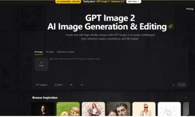
The platform is accessed directly through a web browser without any mandatory registration or download. Upon arrival, the interface presents a clean input area where you can begin your creative session immediately. There is no onboarding tutorial or forced walkthrough, which means you can start testing within seconds of loading the page.
Choosing Your Input Method
Image 2 accepts both text prompts and image references. For text-to-image generation, you simply type your description into the prompt field. For image-based workflows, you can upload a reference photo that the model will use as a visual anchor for style, composition, or subject matter. The platform supports common image formats and processes uploads quickly without requiring additional configuration.
Step 2: Generate and Review the Initial Output
Running the Generation
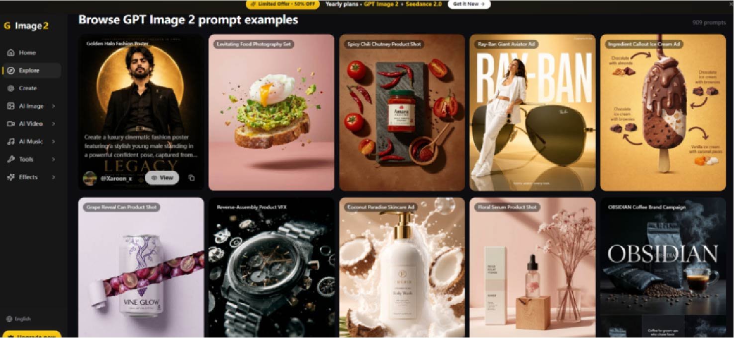
Once your input is ready, initiating the generation is a single click. The platform processes the request and returns one or more images based on your prompt or reference. Generation times vary depending on complexity and current server load, but in testing, most standard requests completed within a reasonable window that supports iterative workflows.
Evaluating the Results
The initial output serves as a starting point rather than a final deliverable. You review the image against your original brief — checking text accuracy, composition, style alignment, and overall quality. This is where the platform’s reasoning capability becomes apparent: prompts that include specific layout instructions, color schemes, or typographic details are generally honored more faithfully than vague or open-ended descriptions.
Step 3: Refine Through Editing or Regeneration
Using Directional Editing
For images that are close but require adjustments, the directional editing tool lets you select an area and describe the change. This is particularly useful for fixing small details without regenerating the entire image. The editing process is iterative — you may need to refine your instruction or try multiple passes to achieve the desired result.
Regenerating With Adjusted Prompts
When the output misses the mark entirely, the most reliable approach is to adjust your prompt and regenerate. The platform’s strong text understanding means that small changes in wording — specifying a material, adding a lighting condition, or clarifying a layout instruction — often produce meaningfully different results. This trial-and-adjustment cycle is where you develop a sense for how the model interprets language and where its strengths and blind spots lie.
Where Image 2 Excels and Where It Still Falls Short
| Dimension | Image 2 Performance | What It Means for Creators |
| Text Rendering | Highly accurate; handles multiple languages with minimal errors | Reliable for typography-heavy assets like posters, social cards, and infographics |
| Character & Style Consistency | Strong style persistence across series; not flawless over long runs | Good for brand assets and campaign materials; may need occasional touch-ups |
| Editing & Refinement | Useful for simple edits; struggles with complex or subtle changes | Best for quick adjustments; complex retouching still requires manual tools |
| Layout & Composition | Handles complex layouts well; occasional issues with extremely dense data | Suitable for dashboards, presentations, and multi-element designs |
| Learning Curve | Minimal; no registration or complex settings required | Accessible to beginners; depth emerges through prompt experimentation |
| Output Consistency | Generally reliable; results may vary with prompt quality and complexity | Best approached as an iterative tool rather than a one-shot solution |
Practical Limitations That Matter for Real-World Use
No tool is without constraints, and Image 2 has several that are worth acknowledging before building a production workflow around it. First, the quality of output is heavily dependent on prompt construction. Vague or underspecified prompts produce generic results, while detailed, structured descriptions yield significantly better images. This means there is a learning curve — not for the interface, but for the language you use to communicate with the model.
Second, the platform’s editing capability, while genuinely useful, is not a replacement for professional retouching tools. Complex edits involving lighting, texture, or fine detail often require multiple attempts and may still fall short of expectations. For creators who need pixel-perfect control, the best workflow appears to be generating a strong base image with Image 2 and then finishing in traditional software.
Third, output consistency is not guaranteed across every generation. While the platform performs reliably for most standard requests, complex scenes with many interacting elements or very specific technical requirements may produce variable results. This is not a dealbreaker — it is consistent with the behavior of most generative AI tools — but it does mean that mission-critical assets benefit from a buffer of extra generation attempts.
Finally, the platform’s strength in creative and conceptual work does not always translate to technical or highly structured diagrams. In testing, attempts to generate architecture diagrams or detailed flowcharts produced visuals that looked polished at a glance but fell apart under professional scrutiny. For these use cases, Image 2 is best used for concept visualization and background assets, with core technical diagrams still created in dedicated tools.
Who Benefits Most From This Approach
The platform’s particular combination of strengths makes it a natural fit for specific creative workflows rather than a universal solution. For solo creators, freelancers, and small teams who need to produce high-quality visual assets without a dedicated design department, Image 2 offers a practical way to generate everything from social media graphics to presentation decks to product mockups. The text accuracy and layout intelligence mean you can delegate tasks that previously required manual typesetting, freeing up time for higher-level creative direction.
For brands and agencies producing series content — campaign materials, newsletter assets, or product line visuals — the style consistency capability reduces the overhead of maintaining visual identity across multiple outputs. You can establish a visual language once and then generate variations without constantly re-specifying colors, fonts, and compositional rules.
For technical creators and developers, the platform serves a more limited but still valuable role. It excels at generating conceptual illustrations, cover images, and ambient visuals that enhance documentation and presentations, but it should not be relied upon for precise technical diagrams or anything requiring strict logical accuracy. The pragmatic approach is to use it where it shines and supplement it with specialized tools where it doesn’t.
The platform is not trying to be everything to everyone, and that clarity is part of its appeal. It handles a specific set of creative tasks with genuine competence, leaves room for human refinement, and doesn’t pretend to replace the designer’s judgment. In a landscape full of tools that overpromise and underdeliver, that restraint is worth noting.